Apply Custom Markers to a Line, Scatter, or Bubble Chart
this is copied from: Markershttp://peltiertech.com/Excel/ChartsHowTo/CustomMarkers.html#ixzz1dhfx9aED
Tired of the same, lame choices for chart series markers? This page shows how to use any custom shape as markers in an Excel chart.
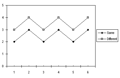
Make your chart, and temporarily use any handy symbol in Excel's extensive palette (there are NINE choices, after all, and 56 colors!).
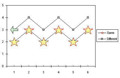
Now on your worksheet, draw the shape you want, from the AutoShapes available on the Drawing toolbar. Size and format it the way you want it to appear in the chart. Our example will start with this fancy five-pointed star.
Copy the custom shape. Activate the chart and select the series in your chart. Use Ctrl-V or Edit menu > Paste to paste. The star becomes your custom data marker.

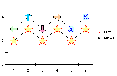
If you have a multiple point series, and you select the entire series before pasting, the copied shape becomes the marker for every point in the series, as above. If you select just one point before pasting, the copied shape becomes the marker for just the selected point. Here are a variety of custom shapes: four arrows of different color and orientation, and two single-character WordArt objects.
Select and copy a shape (the green, left-pointing arrow), then select a single point in a chart series (two single clicks), and paste. The selected point is now marked by the arrow.
Repeat with the remaining shapes and points. Notice that when the entire series is formatted at once, its legend entry picks up the custom series marker. When the points are formatted one-by-one, however, the legend retains the original boring built-in chart series marker.
This technique of applying custom markers works equally well with Line charts and with XY Scatter charts. It works nicely with Bubble charts, as well, with one important difference: the custom markers size themselves in the same way that the standard bubbles do. This is illustrated below with a star and a smiley face.
Select and copy the star, select one series, and paste the star onto the series. Now select the smiley face, copy it, select the other series, and paste.

The markers scale themselves according to the values of the bubble size variable. You may have to adjust the relative size of the markers in your chart. For example, a star doesn't look as large as a smiley face with the same diameter, because of the open space between the arms of the star. Unfortunately the appearance of the legend leaves something to be desired. I generally don't use a legend in this type of chart, I use data labels instead.
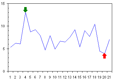
A variation on this technique (Use an Arrow to Indicate Special Points) uses custom markers andconditional chartingto point an arrow at the extreme points in a series.
For more custom chart series formatting, check outBuild a Column or Bar Chart with Images.andWordArt Labels for Custom Chart Series Fills.
Read more:Custom Excel Chart Series Markershttp://peltiertech.com/Excel/ChartsHowTo/CustomMarkers.html#ixzz1dhfx9aED
No comments:
Post a Comment